- Documentation
- Components
- Component - Progress
Progress component
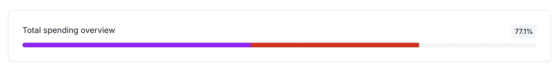
The Progress component provides a visual representation of completion status or data distribution through customizable progress bars. It supports both single progress bars for displaying overall completion percentages and multi-segment progress bars that can be divided into multiple smaller sections with different widths and colors. This flexibility makes it ideal for showing complex data breakdowns, multi-step process completion, or comparative metrics within a unified visual element. The component integrates seamlessly with the Unfold design system and includes full dark mode support for consistent theming across different environments.
Example function for passing arguments to progress bar
def progress_params():
    return {
        "title": "Progress bar title",
        "description": "Total 57.5%",
        "progress_class": "extra_css_class",
        "value": 57.5,
    }
Progress bar params with multiple segments
def multiple_progressbar_items():
    return {
        "title": "Progress bar title",
        "description": "Total 57.5%",
        "items": [
            {
                "title": "First part of progress bar",
                "value": 30.0,
                "progress-class": "override-color",
            },
            {
                "title": "Second part of progress bar",
                "value": 20.0,
                "progress-class": "use-another-color",
            },
        ]
    }
{% load unfold %}

{% component "unfold/components/progress.html" with title=item.title description=item.description value=item.value %}
{% endcomponent %}
© 2023 - 2026 Created by unfoldadmin.com. All rights reserved.